CUBO DRIVE
REBRANDING (2025)
BRIEFING
Cubo Drive is a company specialized in the fast and flexible rental of vehicles and heavy equipment for the construction and industrial sectors. The brand needed a refreshed identity that could reflect its core values: speed, efficiency, reliability, and adaptability.
The rebranding aimed to reposition Cubo Drive as a modern, professional, and trustworthy partner for businesses — while communicating the agility of its services and the strength of its growing fleet.
PROPOSAL
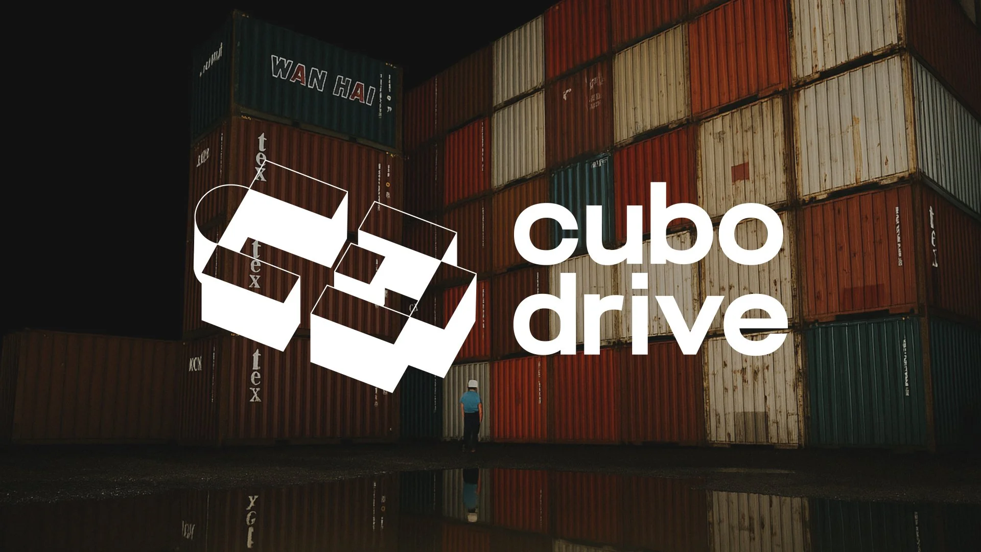
The new Cubo Drive logo is directly inspired by the brand’s own business: construction, structure, and motion.
The symbol draws from the modular forms of containers and equipment used by the company, evoking a sense of systems, adaptability, and interlocking parts. Its geometric, technical design — with a hint of isometric perspective (conveys strength, precision, and direction).
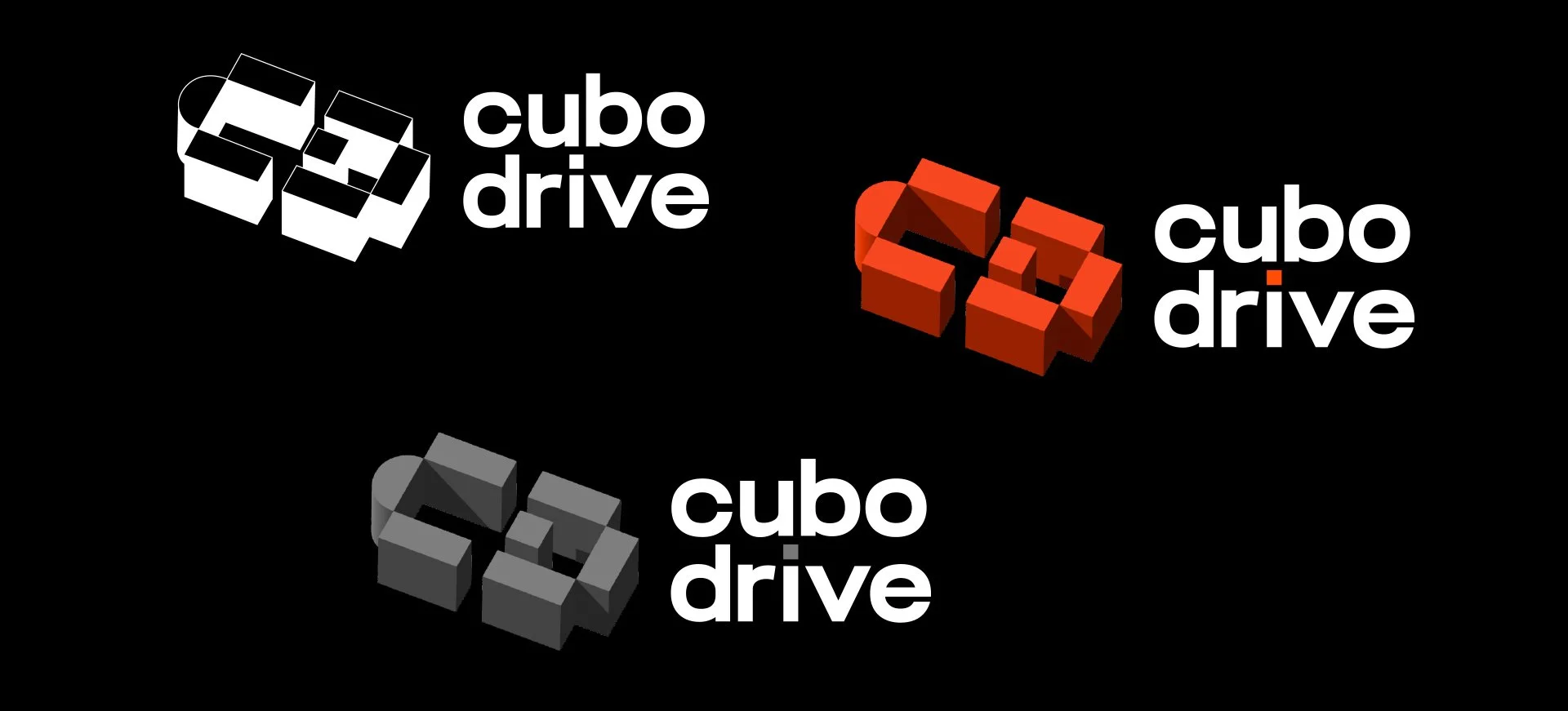
The shape can also be read as an abstract representation of the letters “C” and “D”, subtly reinforcing the brand name in a clever, non-literal way.
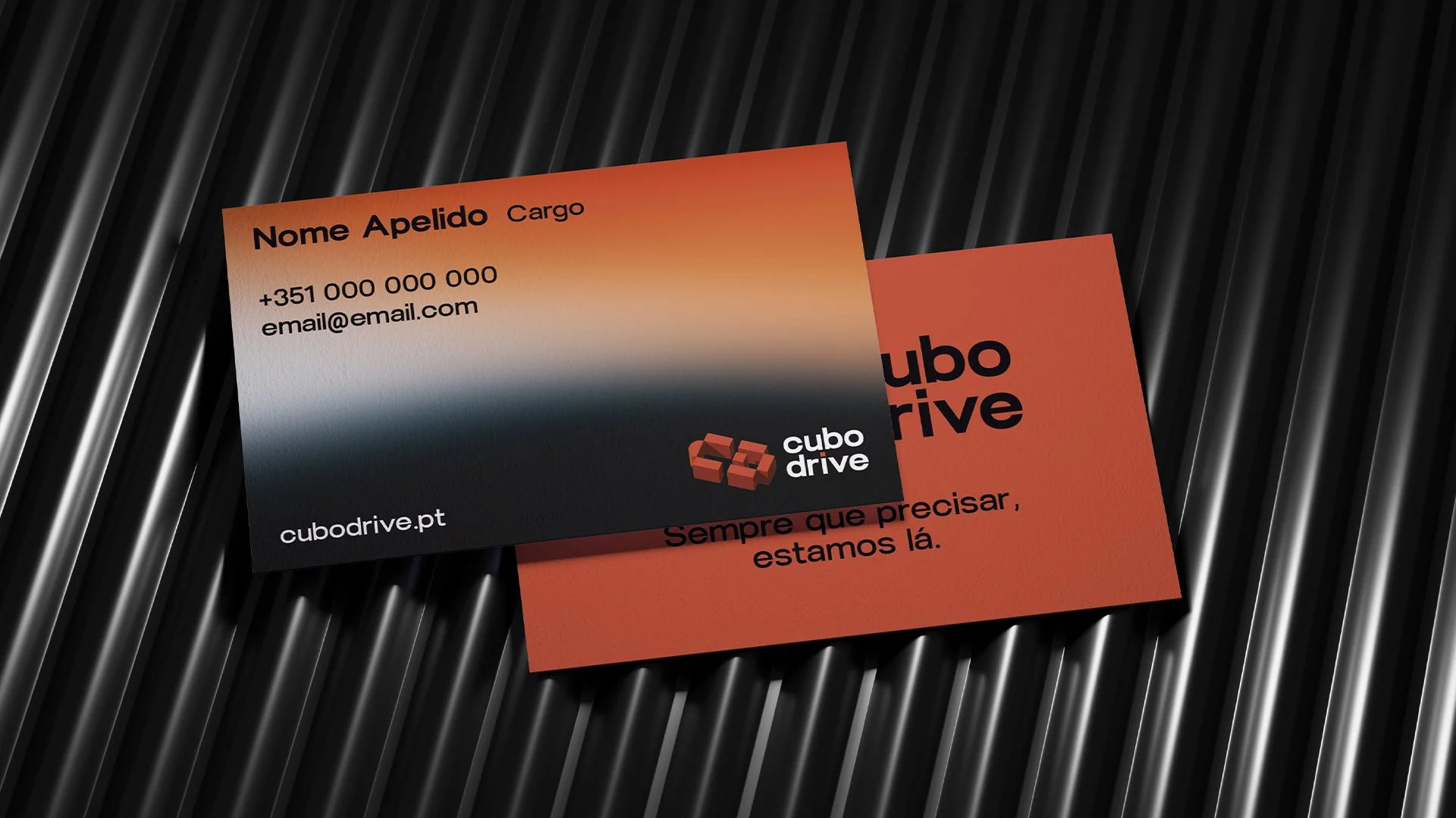
The lowercase wordmark adds a sense of modernity and approachability, while the yellow dot on the “i” becomes a distinctive visual anchor — suggesting focus, detail, and action. A subtle yet powerful signature.

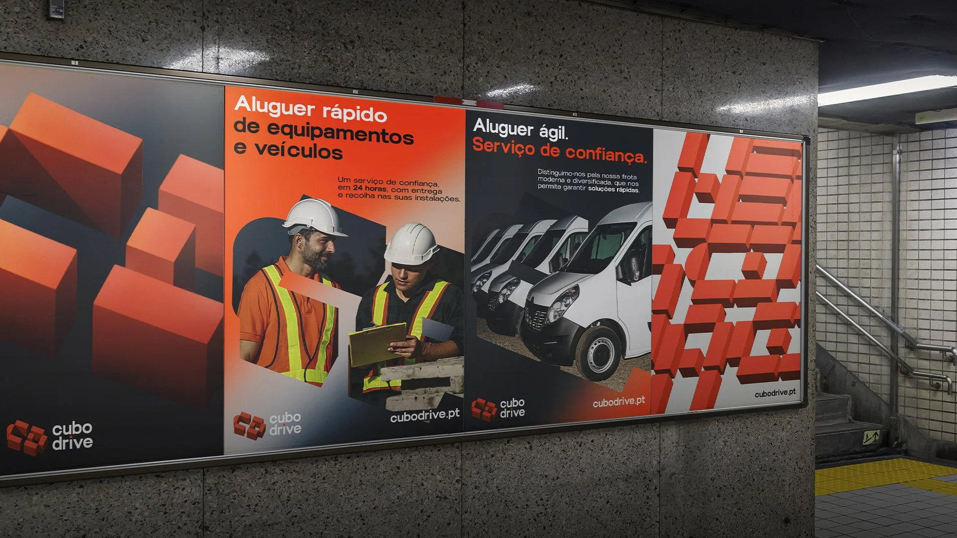
The primary color — orange — communicates energy, movement, and urgency. It’s a tone strongly associated with construction, heavy machinery, and safety, instantly connecting the brand to its field of expertise.
Complemented by deep blue, black, light gray, and white, the palette strikes a balance between dynamism and reliability, reinforcing both the bold character and the trustworthy foundation of the Cubo Drive identity.
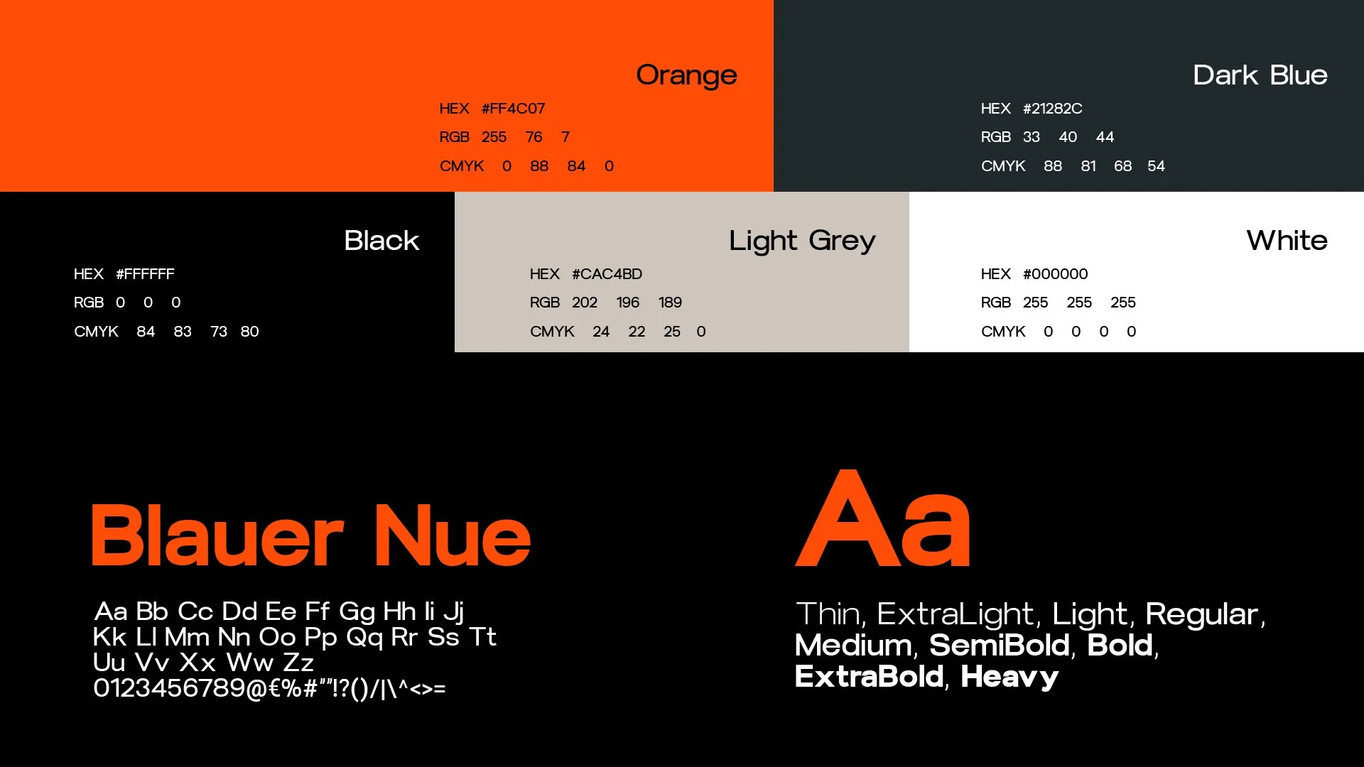
The chosen typeface stands out for its robustness and functionality. It’s a clean, sans-serif font with stable proportions and sharp cuts — conveying a sense of technology, reliability, and modernity.
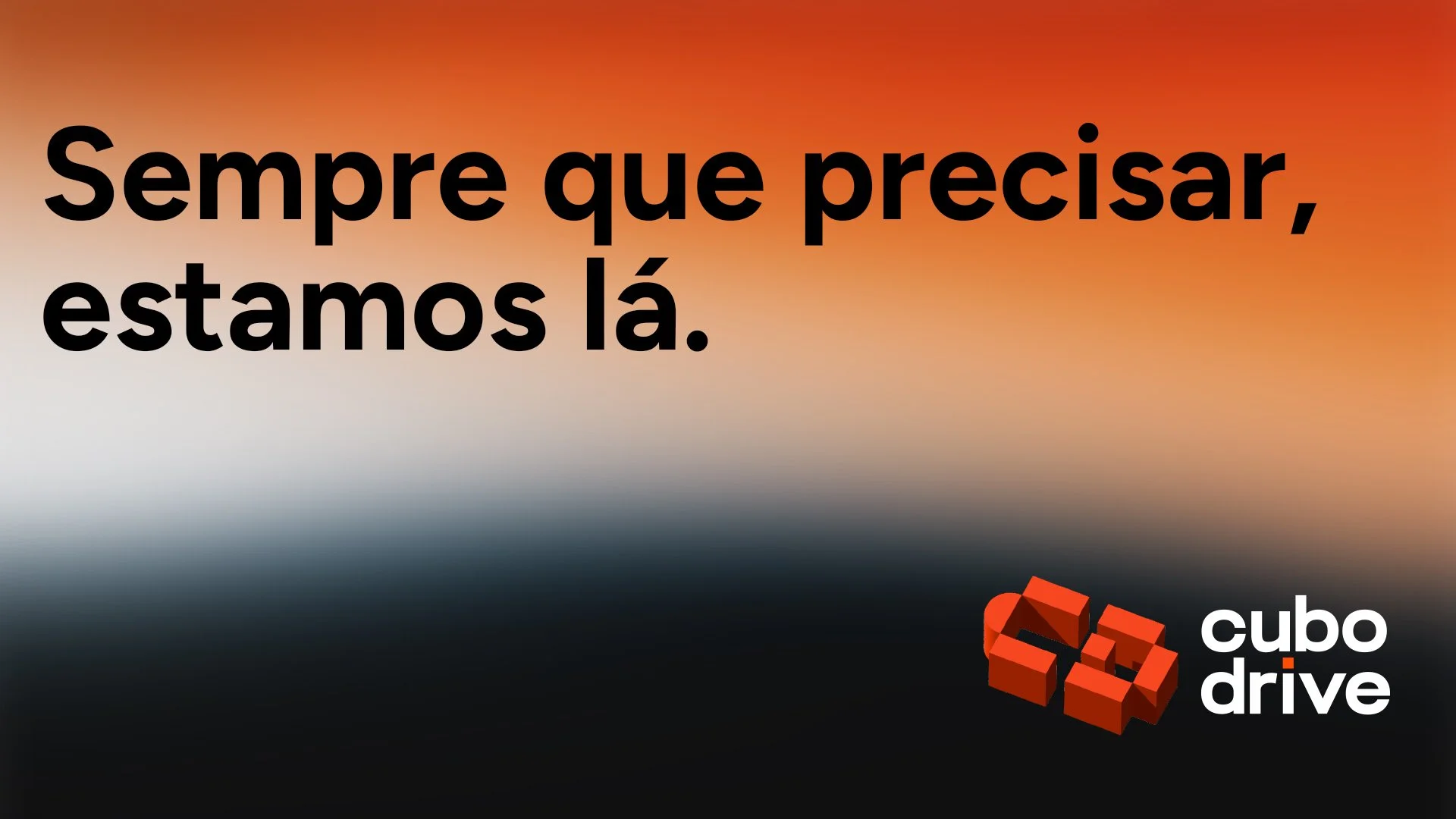
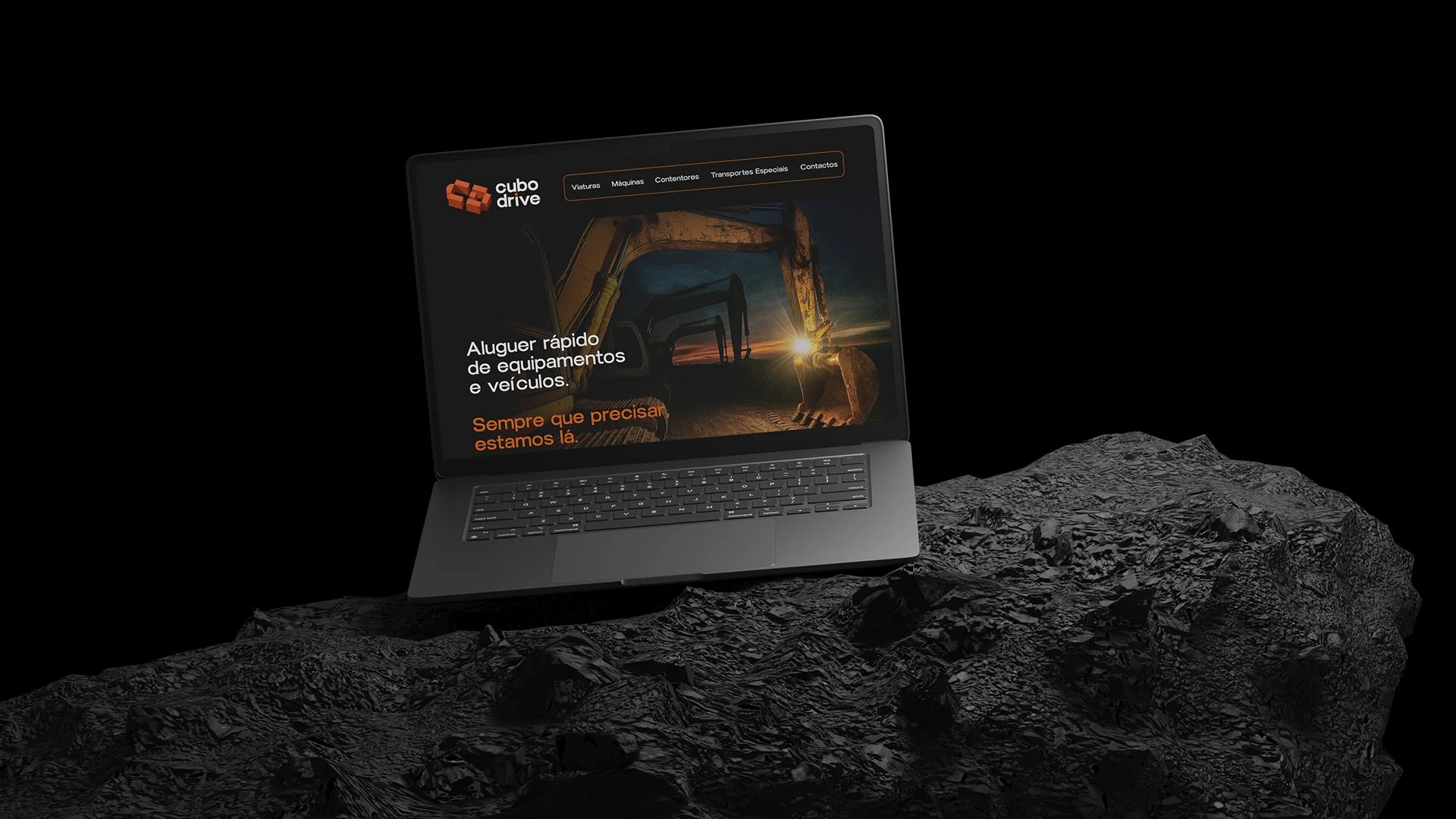
A brand signature that reflects Cubo Drive’s commitment to availability, reliability, and readiness. More than just a promise, it captures the brand’s everyday reality on the ground: responding quickly, acting efficiently, and being there when clients need it most.
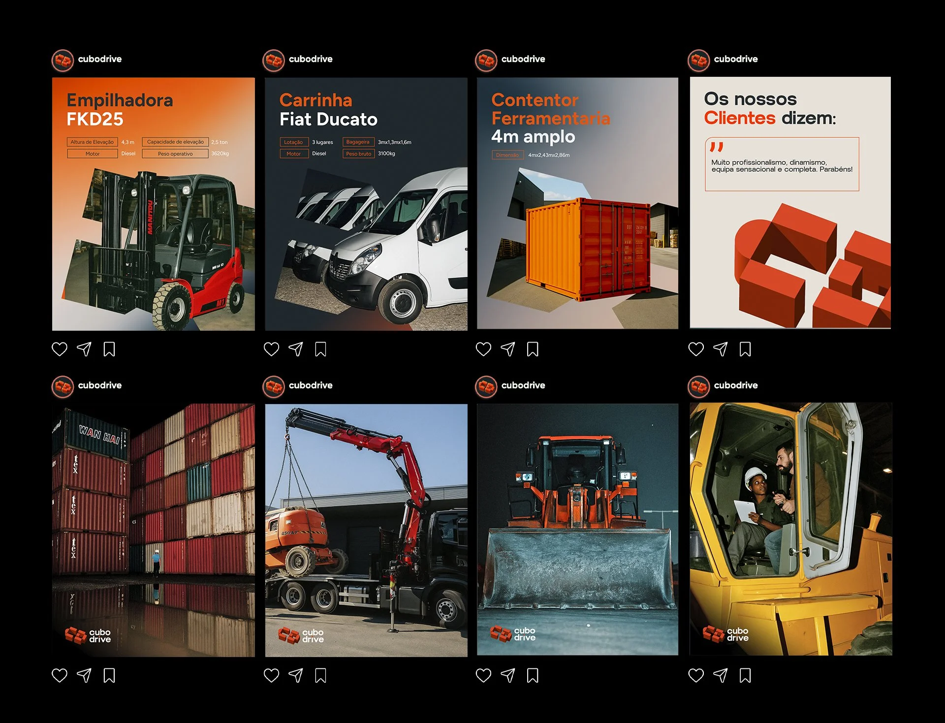
The new content strategy for Cubo Drive’s social media is anchored in three main pillars: showcasing key equipment through visually impactful posts with real photos and essential specs; revealing the behind-the-scenes of operations with a strong, cinematic visual style that captures authenticity and the brand’s day-to-day energy; and sharing real client testimonials in a consistent design format that reinforces trust and credibility. Together, these content types strengthen the brand’s presence, communicate its values, and engage the audience with clarity and professionalism.
As part of the brand’s digital activation, a new website and digital catalogue were developed to centralize and simplify access to the Cubo Drive offering. Designed for clarity and functionality, both tools highlight the full range of vehicles and equipment, making it easier for clients to explore, compare, and request rentals across all devices. Together, they reinforce the brand's digital presence and provide a seamless, on-demand experience.

END CREDITS
Year: 2025
Agency: IVY Brand Agency
Director of Brand Strategy: Sandra Brás
Designer: Fábio Franco
Copywriter: Fábio Franco, Inês Moreira
Account Executive: Inês Moreira