METACASE LYQEN BRANDING
Design
2025
Briefing
Metacase, a leading provider of financial management technology, is launching a new platform for medium-sized companies to simplify and centralize financial flow management. Supported by the credibility of Metacase and SIBS, the platform offers real-time liquidity insights, automated bank reconciliation, and streamlined control over financial instruments — all in a self-service solution focused on autonomy, reliability, and innovation. The goal is to position the product as a trusted financial expert that combines technical authority and security with simplicity and modern usability.
Proposal
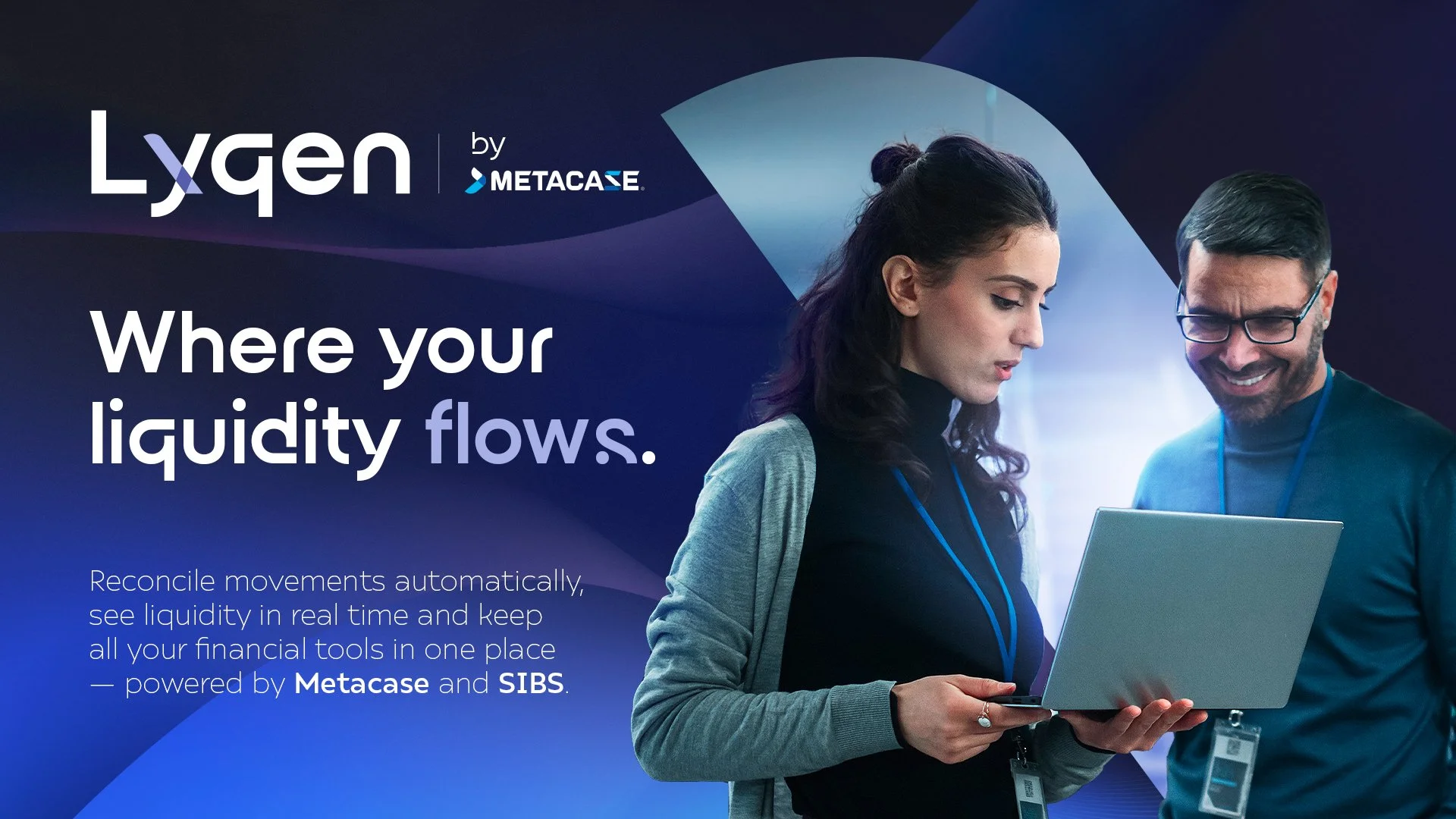
Meet Lyqen — a name born from the words liquid and liquidity, designed to embody flow, balance, and intelligence in financial management. Inspired by the resilience and adaptability of lichen, it symbolises growth on solid ground and the seamless integration of complex elements into a unified system.
This concept is carried through to the visual identity: a minimalist, international logotype where the translucent overlap in the “Y” represents the convergence of financial streams into one controlled flow.
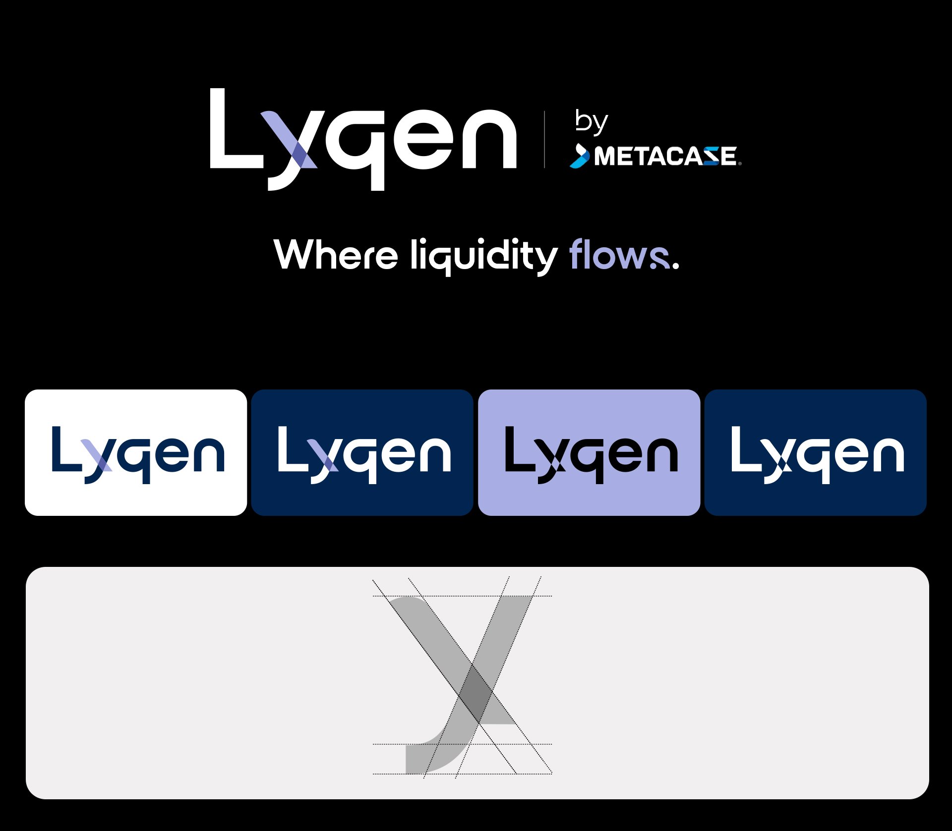
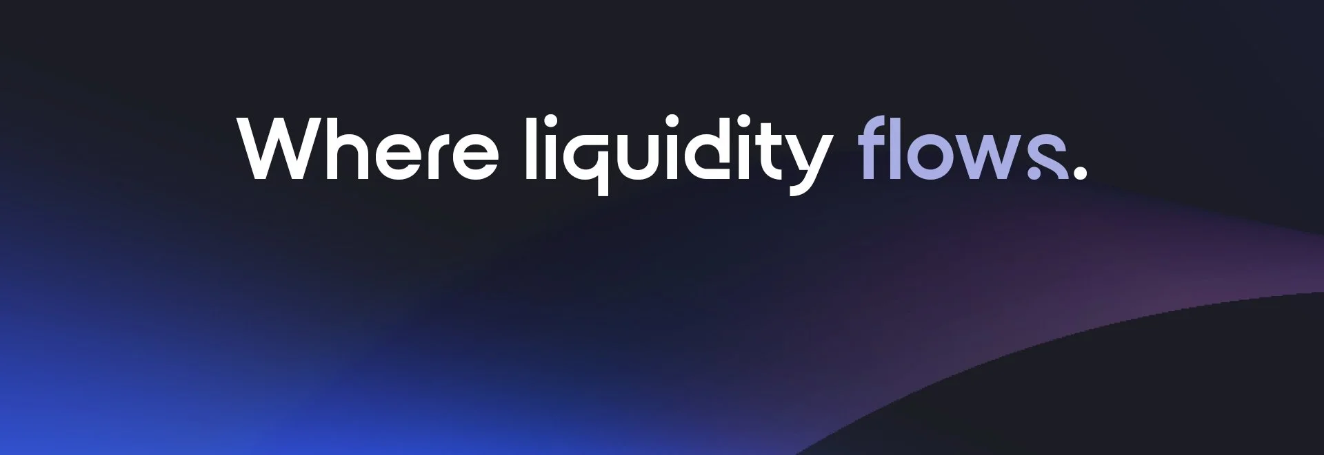
The tagline encapsulates Lyqen’s purpose: to create an ecosystem where liquidity is no longer static but flows continuously and in a controlled way. It acts as both a visual and functional metaphor, expressing not just what the software does — transforming financial complexity into clarity — but also how it does it: intelligently, seamlessly, and with precision.
The color palette was designed to reflect its connection to the parent brand, Metacase, while maintaining its own distinct identity.
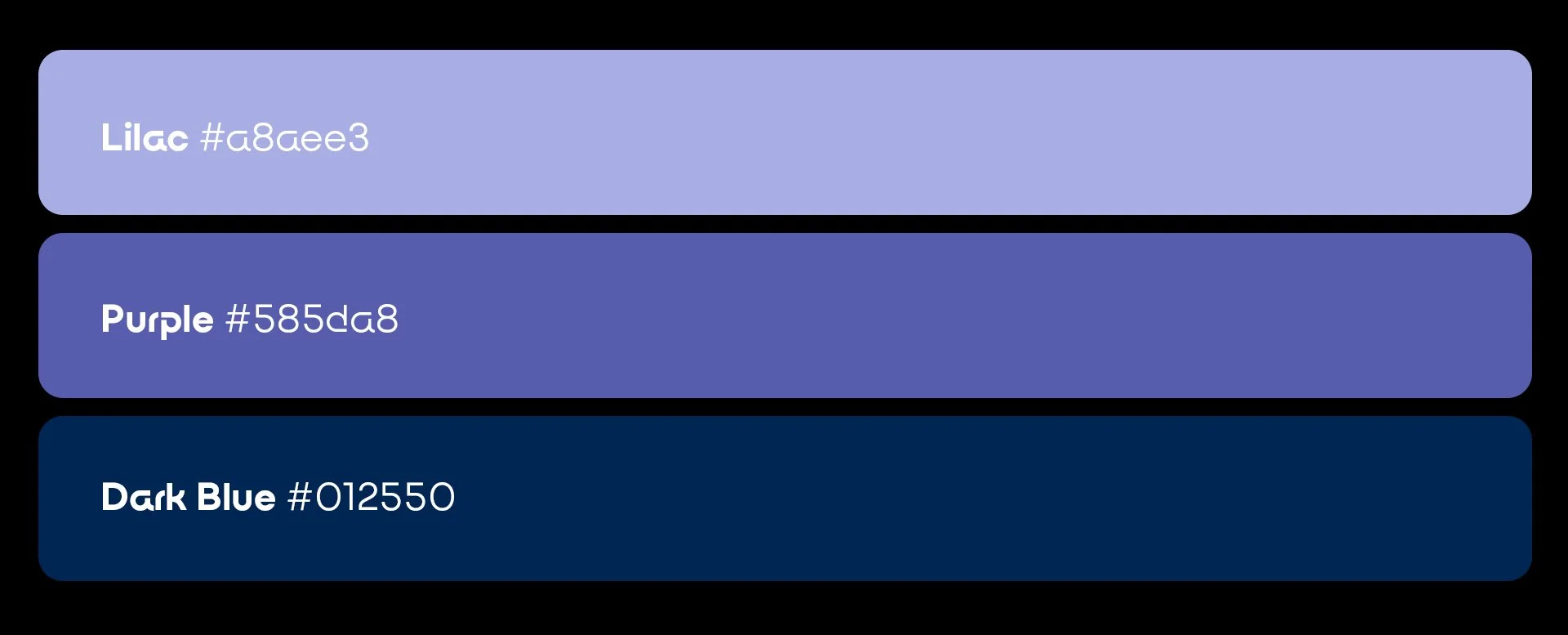
Lilac was strategically chosen to humanize and modernize the brand. It represents clarity, technology, and fluidity, creating a bridge between the rational and the intuitive.
At the intersection of the “Y” flows, purple emerges — the result of merging blue and lilac.
A symbolic hue that expresses harmony, balance, and integration.
Dark blue conveys trust, stability, and financial rigor, establishing a solid foundation that inherits the group’s credibility.
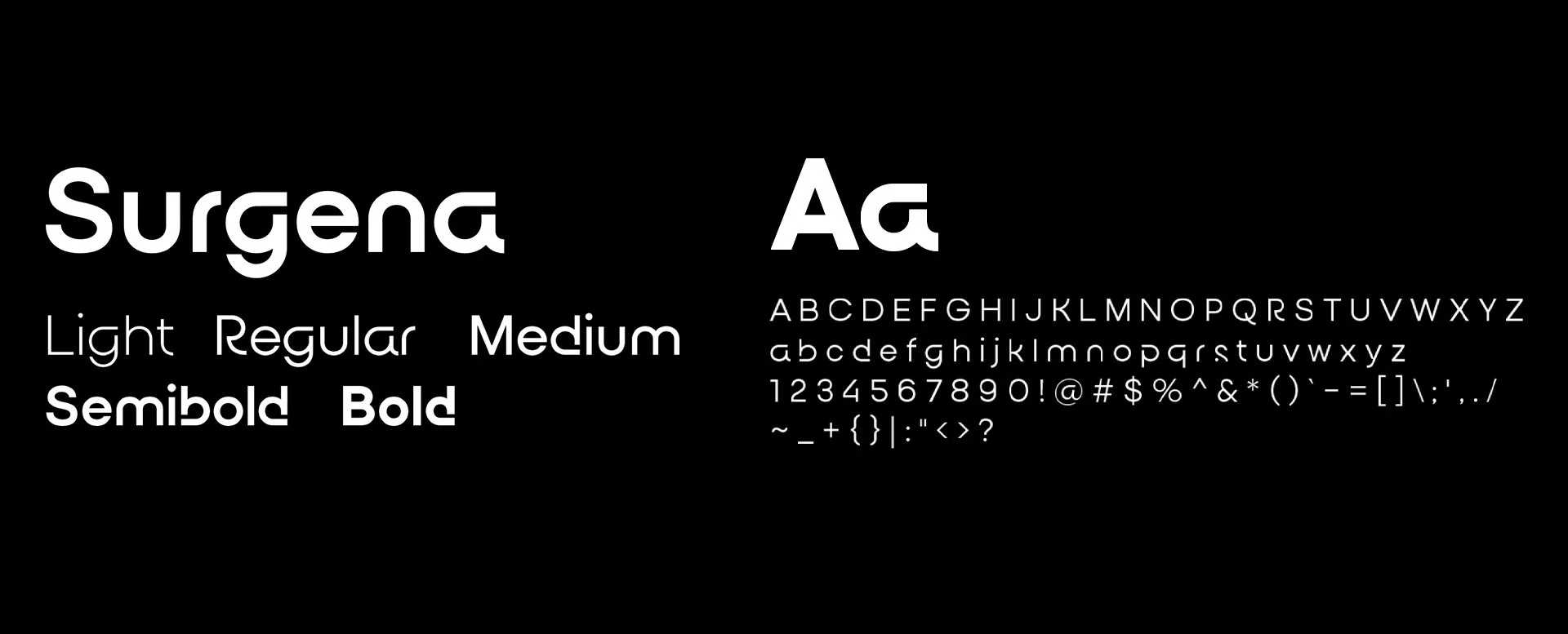
The typographic identity uses the Surgena typeface,
a contemporary sans-serif that balances technology
and approachability.
Surgena, with its clean design and subtle curves, conveys clarity, precision, and lightness, reinforcing the idea of
a brand that is intelligent yet approachable.
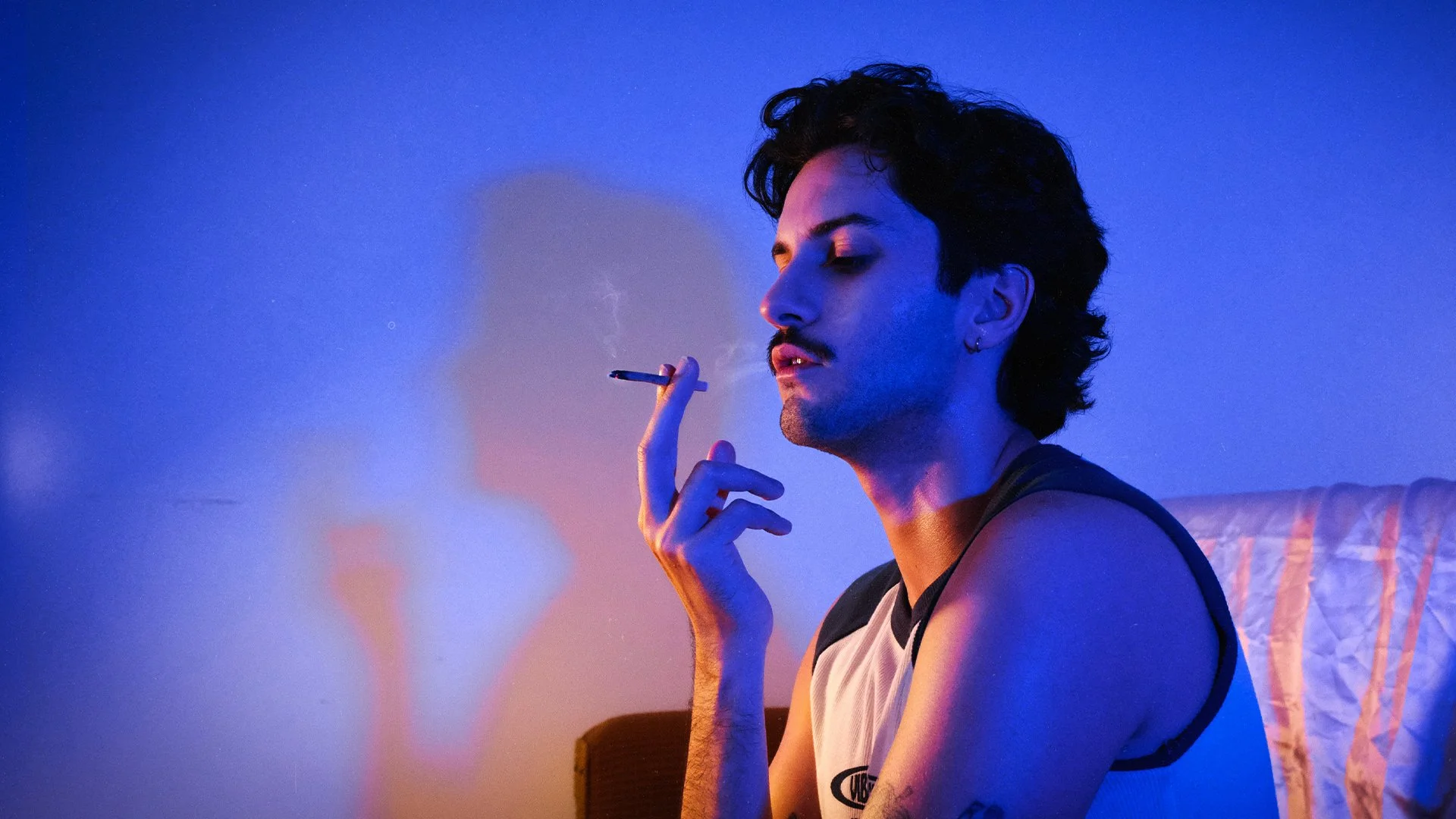
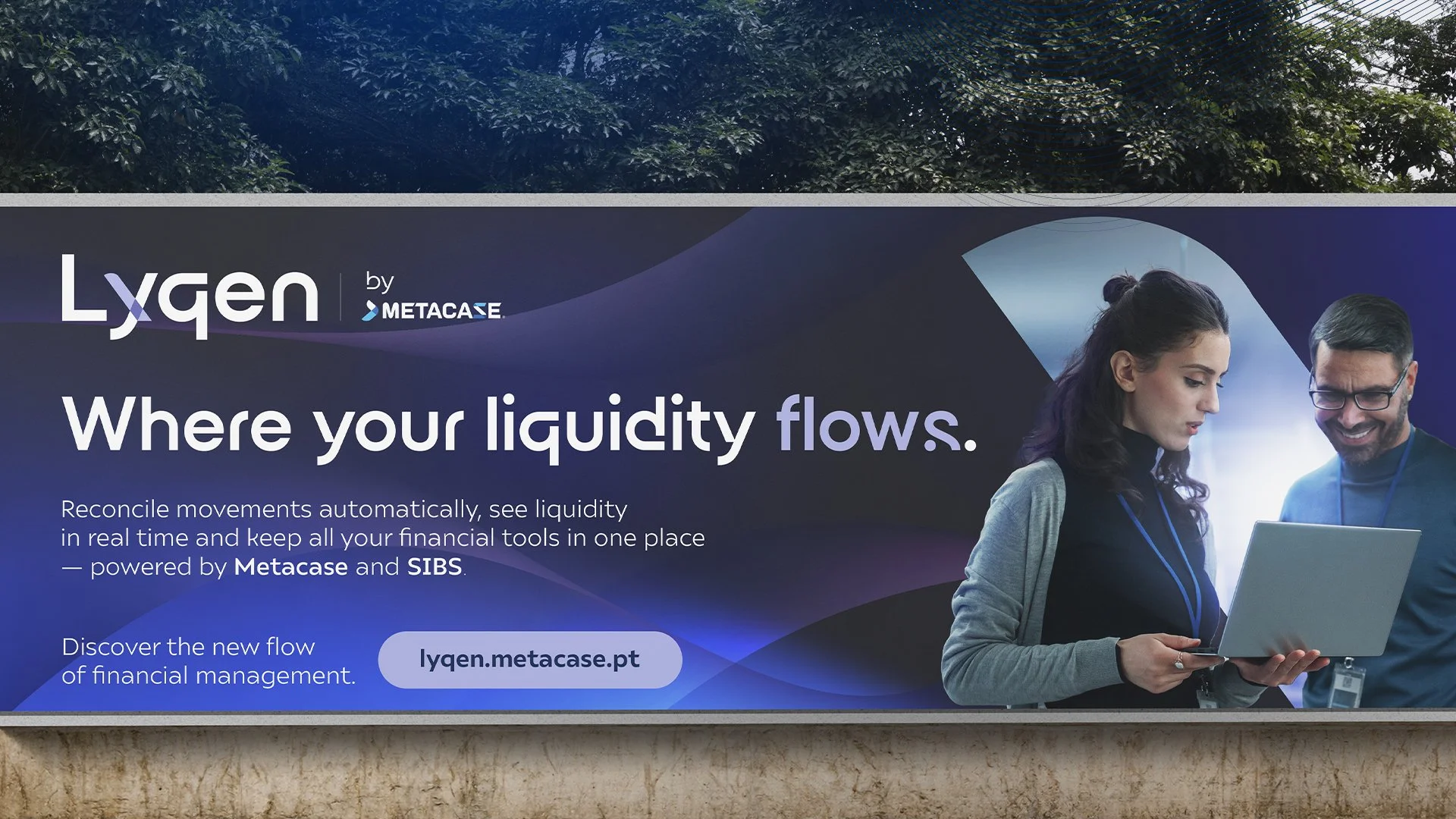
Once the identity was defined, it was time to bring it to life and show the market what Lyqen stands for.
The starting point: a hero video, conceived as the brand’s central launch piece and manifesto.
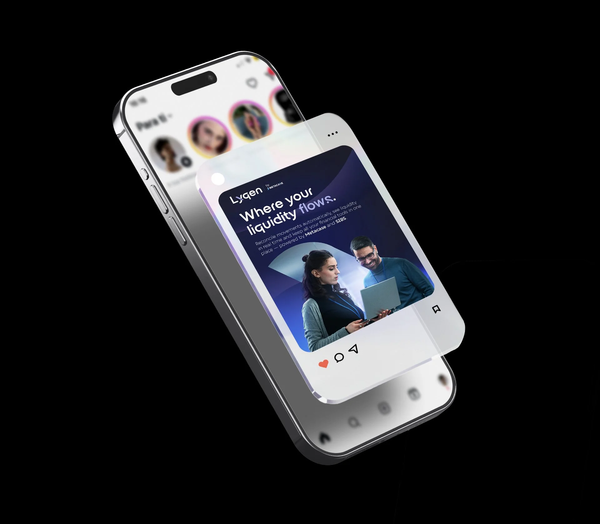
Conceived as the hero asset for the launch, the video and static key visual were designed to be shared on social media and adapted to digital formats such as banners, ensuring consistency and flexibility across all brand communications.
End Credits
Year: 2025
Agency: IVY Brand Agency
Director of Brands Strategy: Sandra Brás
Graphic Designer: Fábio Franco
Motion Designer: Fábio Franco
Copywriter: Fábio Franco, Sandra Brás
Account Executive: Sandra Brás
MORE PROJECTS
MORE PROJECTS
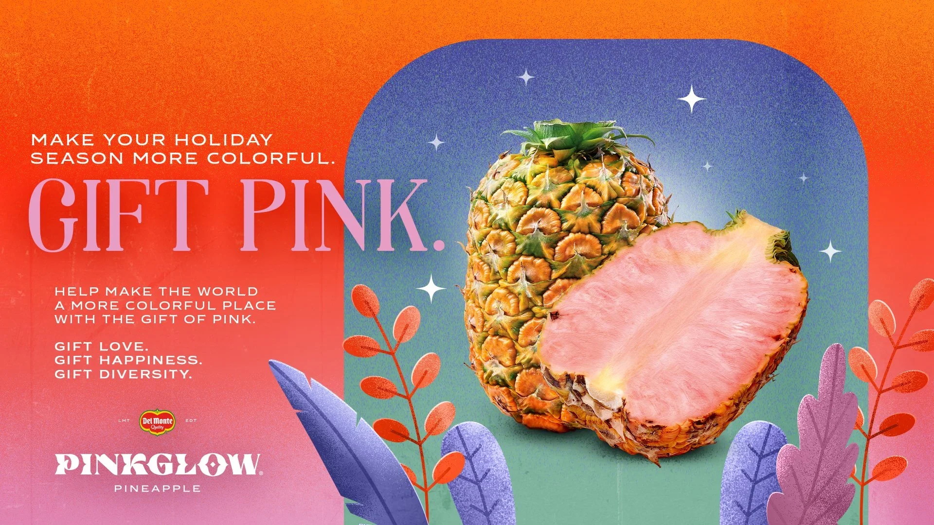
Del Monte Pinkglow Holiday’s Campaign 2024
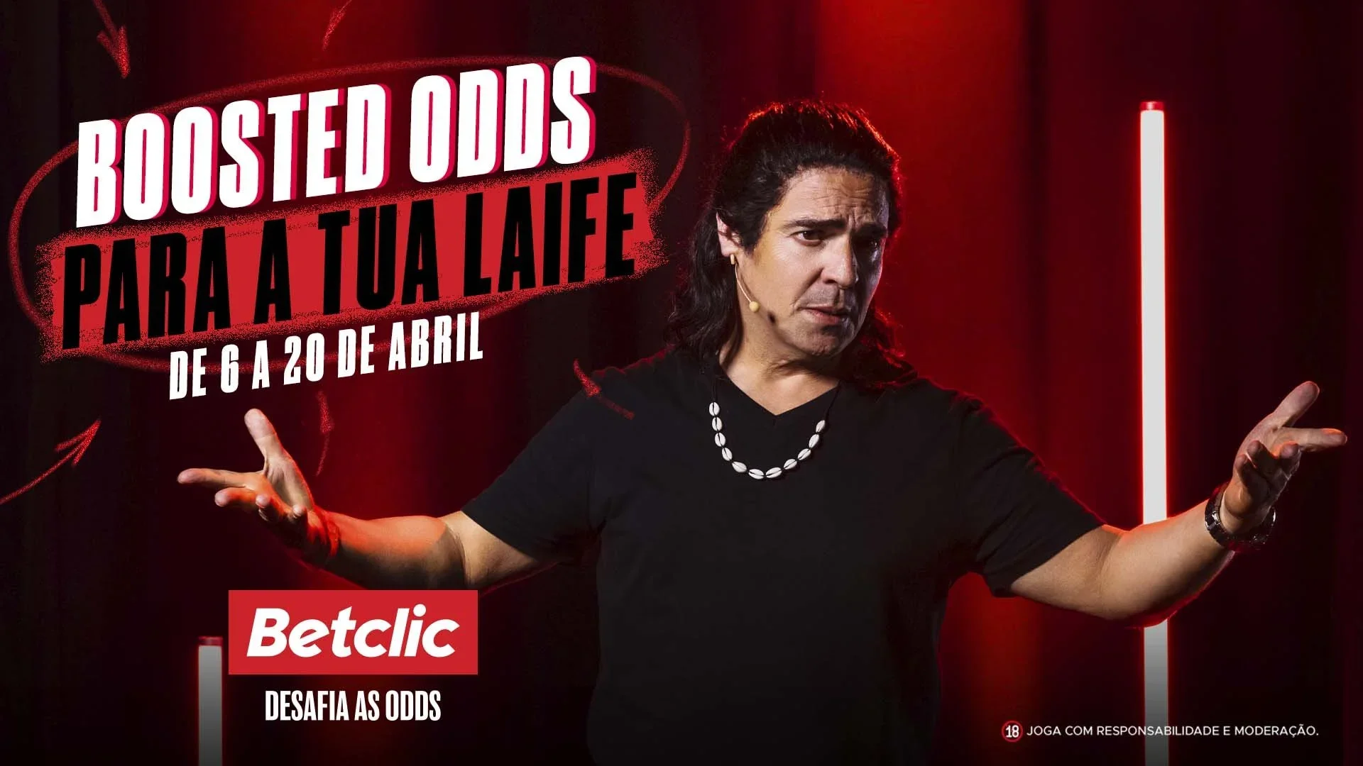
Betclic Boosted Odds Campaign 2022
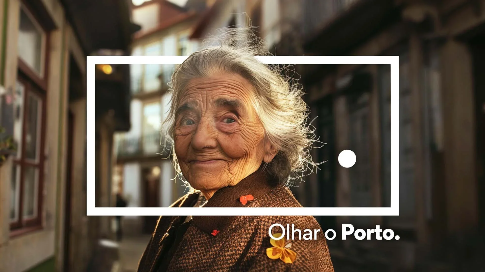
Porto. 10 Year Aniversary Campaign 2024